Elemental design for Japanese creative agency
Asatsu-DK
@Convoy, Causeway Bay
Asatsu-DK (one Japan's top three advertising agencies) commissioned Interspace to design and build a new creative studio and office in Hong Kong. Key to ADK's decision to work with Interspace was our commitment to deliver a completed project within an extremely short timeframe without compromising on quality or design. The Interspace team met this challenge and produced a striking new design for ADK.
The design concept for this project was based on the raw elements of wood, stone, and metal. Geometric lines and materials intersect at oblique angles, playing off the unusual shape of the @Convoy building, creating a sense of openness within the confines of Hong Kong's typically tight spaces. Complex lighting highlights the design features and amplifies the client's requested mood for public and private areas throughout the office.
Reception Area
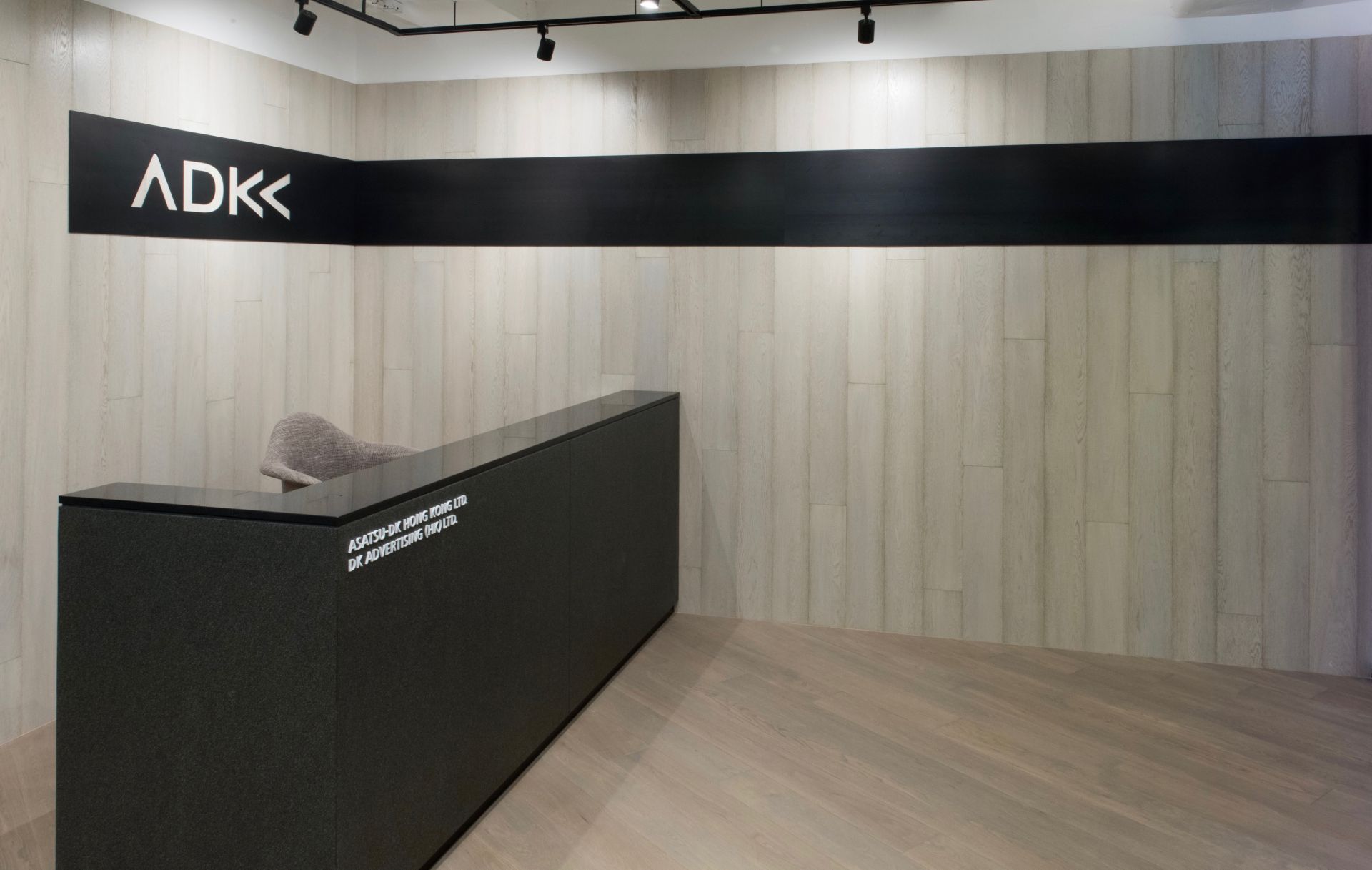
Our three key elements (wood, metal, & stone) feature in ADK's new reception area. The company's logo has been cut from a plate of raw, black steel trimming which extends from the reception to the main entrance, perpendicular to bleached oak wall panels. Granite cladding on the reception counter conveys a sense of stability and permanence, seemingly floating on a hardwood ash finished floor.
Front of House
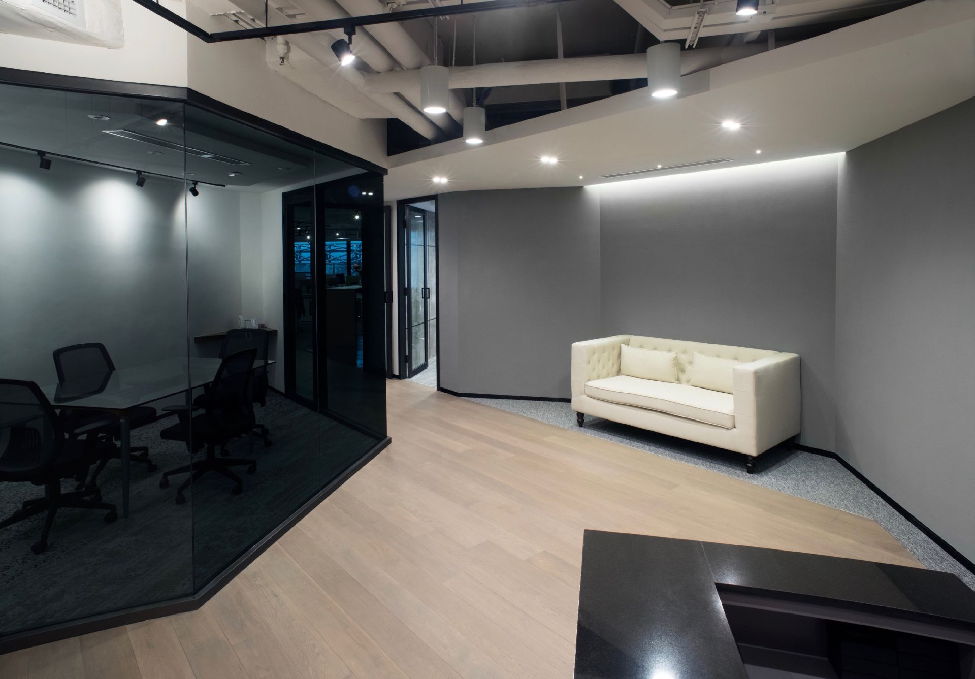
The ashwood floor becomes a pathway which bisects the front of house area, passing between the meeting and conference rooms, with a cosy sitting area tucked into a corner alcove with gray stucco walls. Steel frames and skirting define the borders of this space, and a gray glass wall adds privacy for users inside the meeting room. Thanks to the use of track lights and multiple independent controls, lighting in this area can be easily reconfigured for various functions and moods.
Open Pantry
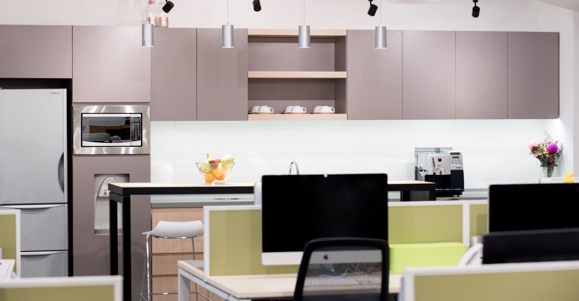
An open pantry is integrated into the Back of House area, blending into the office space. Feature lighting and cement flooring define the service area, with all utilities and appliances neatly aligned against the boundary wall. A bar counter serves as the pantry's focal point and a breakout space for informal team meetings.
Focus on Lighting
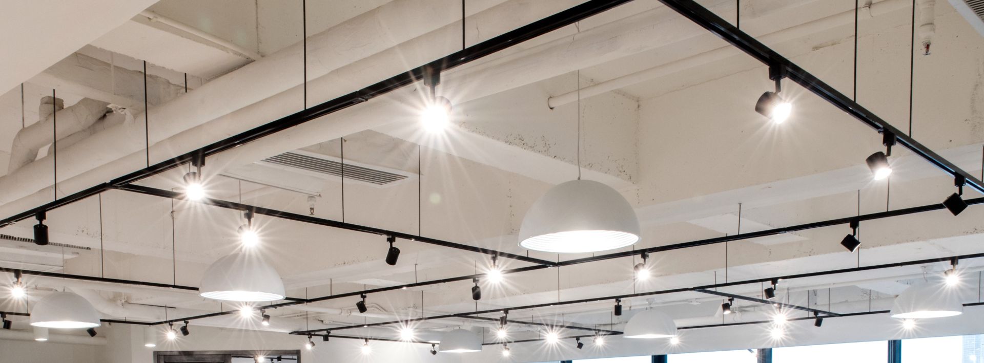
A completely open ceiling in the office area created an opportunity for a customized lighting solution. Meticulously planned alignment of light tracks adds a high-level design element, establishing a virutal ceiling on the pure white structural background. Simple LED lighting elements snap on or off the light tracks, giving ADK independence to reconfigure lighting as their team's needs change. Large, circular domes provide ambient light for each group of workstations, and can be separately controlled to set the mood for the back office area.
