Precision Design for Trading Technology Company
Interactive Brokers
AIA Tower, Landmark East
Interactive Brokers selected Interspace to design and build their expansion office in Kowloon East. This medium-size project represented an opportunity to apply our exacting design standards and construction practices into a completely new space without the complexity of reuse of existing furnishings. Our client allowed us significant freedom to use colors and materials we felt best complemented their corporate image and the function of this office.
The core concept of our design was to ensure as much symmetry and design conherence with the existing space as possible. Building installations were carefully mapped out and planned to seamlessly join with our layout and finishes. Infrastructure was hidden away with easy access and flexible arrangements for expansion or restacking. Our project and design teams worked hand-in-hand to ensure every design vision could be realized and that any construction plans could be amended without affecting the project schedule.
Geometrically Balanced Lobby
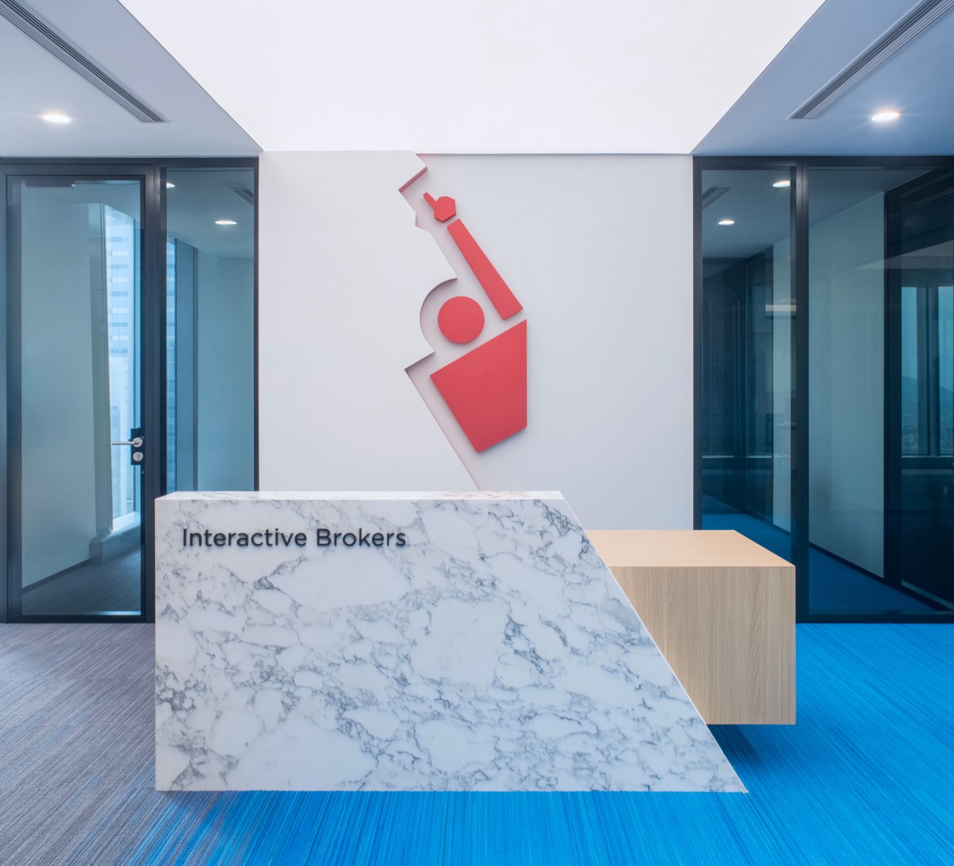
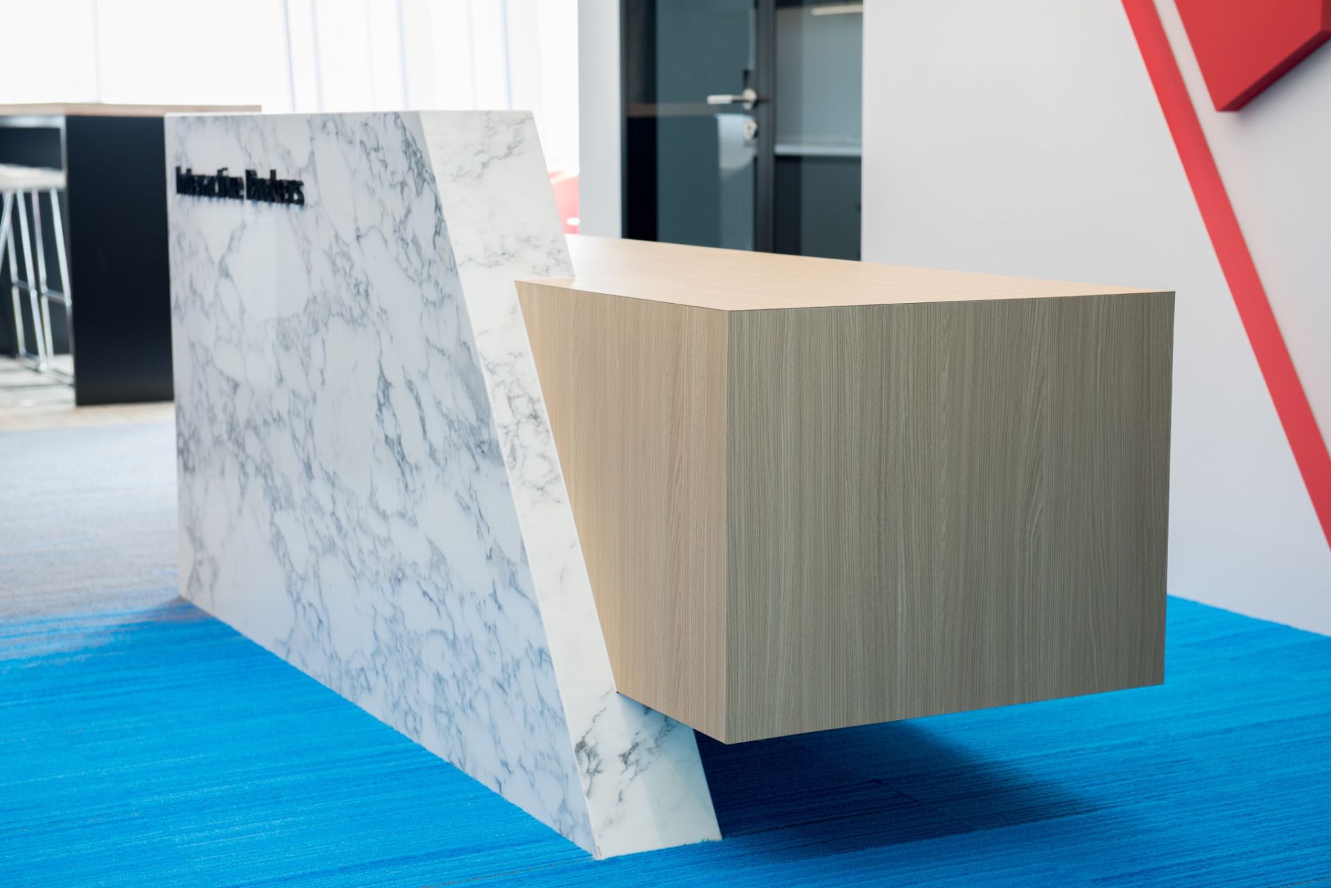
The reception area for Interactive Brokers (IB) has been meticulously engineered to appear as symmetrical as possible, with the only asymetry coming from critical branding features: IB's "Red Man" logo and a cantilevered reception desk.
Maars Living Walls' Panorama system was selected for all glazed partitions for its unique framework and extremely thin double-glazed door profile. The structure of the glazing system and door were analyzed when designing this room, with extra framing added to the opposite side to balance the symmetry.
A full-length Barrisol light diffuser with LED backing seamlessly blends into the shape of the logo wall, illuminating the space with a warm, ambient glow; the sizing of the diffuser was optimized to provide maximum coverage without any interfering fire sprinklers or other M&E works.
The logo wall design incorporates a single piece of frosted glass which exceeds the maximum dimensions of the building's lifts. So after modeling the materials and lift dimensions, a small notch was cut from the lower left corner (hidden by the top layer of lacquered wood) providing just enough clearance for delivery and installation of the materials.
The result of all this careful planning: a wholly unique, stand-out reception!
Featured Open Pantry
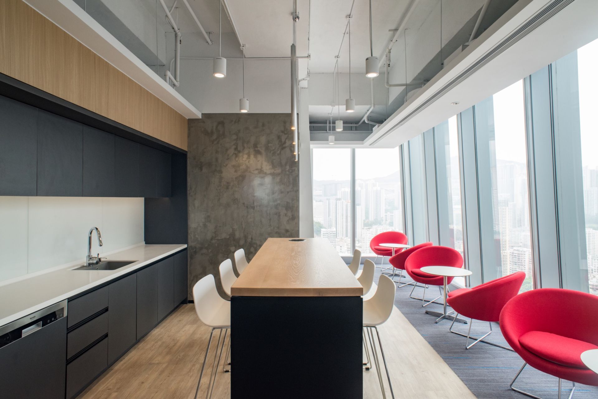
An open pantry feature seamlessly blends into the reception area as an expanded waiting area for guests, breakout space for team discussions, and a warm up/cool down zone for meetings. A section of the false ceiling was removed above the pantry, to create an "atrium feel," with a floor to ceiling height of more than four meters. All MVAC ducting, Fire Sprinklers, and Electrical trunking were removed or rerouted in the open ceiling area to make the design as tidy as possible. Fully integrated appliances we selected to keep the lines of the pantry cabinets clean and neat.
Sophisticated Meeting Space
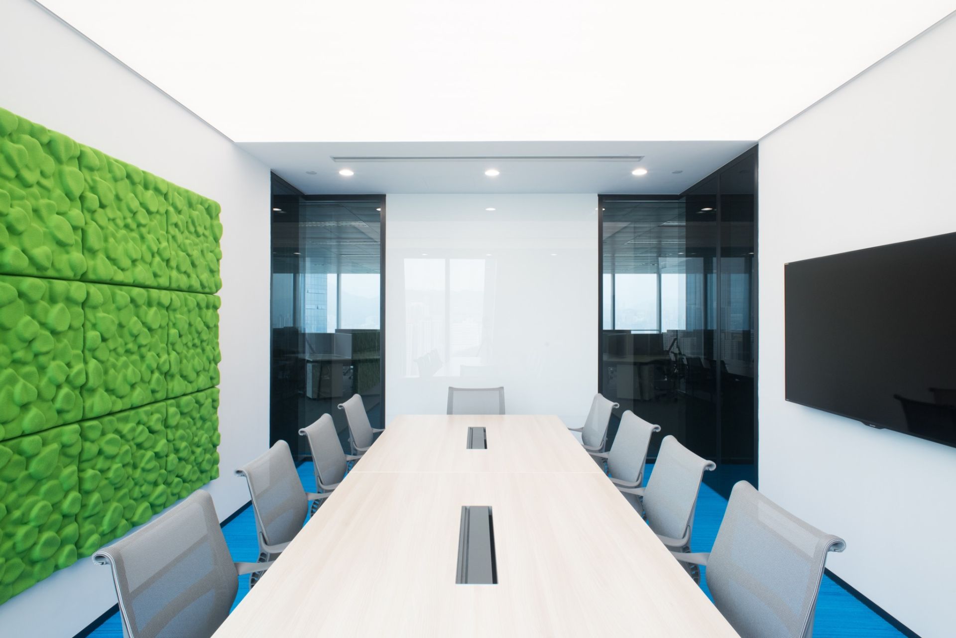
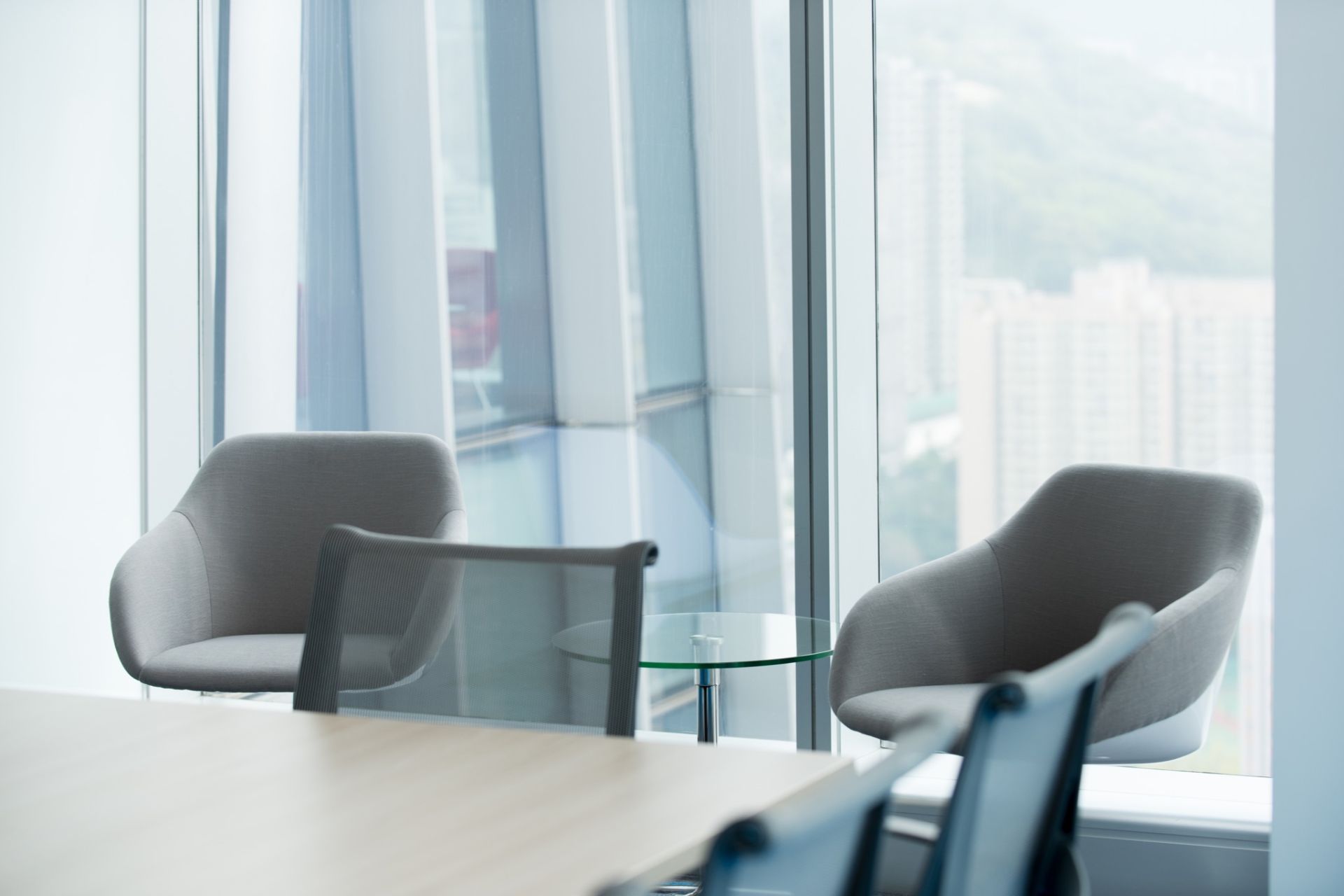
This meeting room is directly behind the reception counter, so consistency of design and acoustic performance were our primary concerns. The reception's Barrisol ceiling light feature continues through the logo wall and into this space, precisely mirroring the geometry of the reception area. A TV wall is mounted to the back side of the "Red Man" logo wall, ensuring absolute visual privacy, while a glass markerboard is set between two double-glazed, tinted, "curiosity" feature window panels offering a peek into the office area for guests to appreciate the dynamism of this workplace. A section of molded felt acoustic panels (with acoustic insulation backing) adds visual life to the room while helping to reduce reverberation from audio equipment. Herman Miller Setu chairs and a POSH meeting table contribute just the right level of sophistication for visitors.
Multi-Function Space
Window-side lounge chairs act as a breakout zone within the meeting room, and provide alternative use options for the space: low seating for lunch/tea time, intimate discussion for one-on-one meetings, and a quiet space for mid-day rejuvination. The view from this side of the office also offers a unique vantage point for observation of the Urban Renewal Authority's revitalization project across Kwun Tong Road.
Open & Cheerful
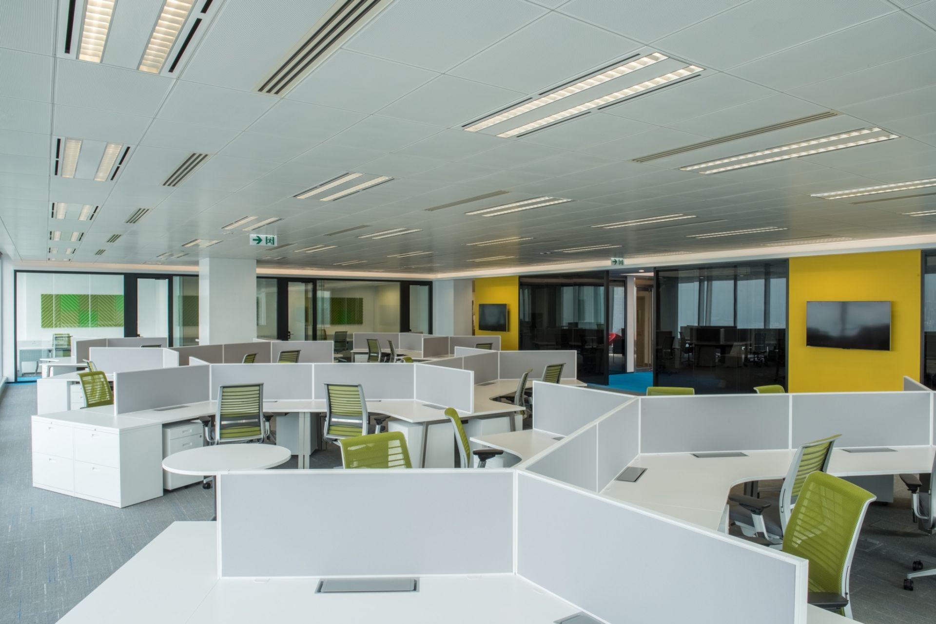
Copious space in the open office area allows a more playful layout using clusters of 120 degree Steelcase Lexicon workstations with intermediate discussion tables. Ergonomic seating being a HR priority, Think chairs from Steelcase with 4D adjustable arms and integrated lumbar supports were selected as a uniform standard for all levels of staff.
Splashes of yellow and green color envigorate the space, while the perimeter lighting trough and ceiling feature play a dual role of brightening the environment and concealing the interface between the partitions and the ceiling grid. Geometric aesthetics were key, with every partition carefully planned to precisely match window mullion positions.
Private Transparency
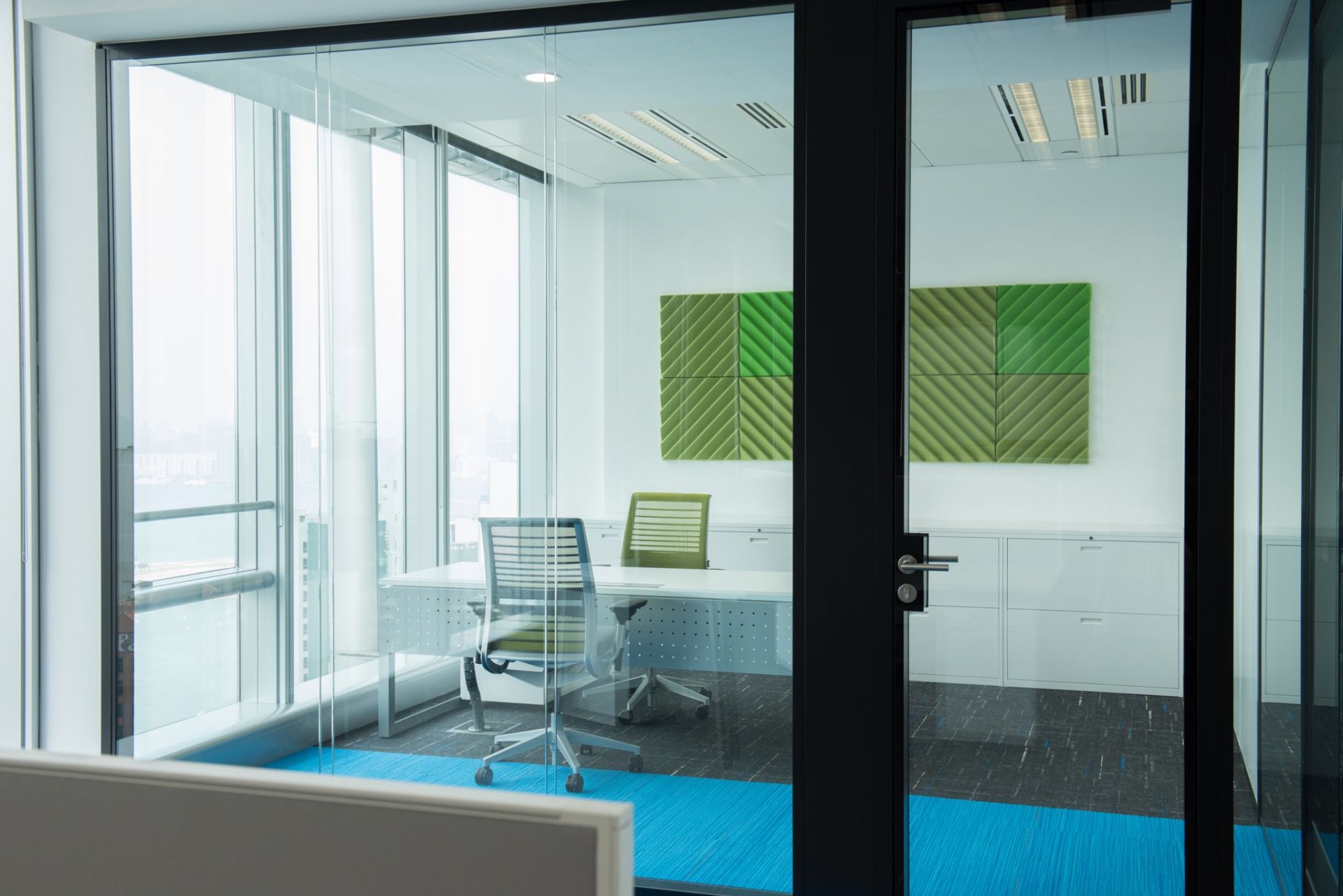
Our geometric design language continues inside the private rooms, with tidy wiring columns for light switches and temperature controls adjacent to every door, and perfectly aligned and mirrored carpet and ceiling features. Clear, double-glazed partitions and doors offer senior staff the balanced benefits of visual transparency and acoustic privacy when doors are closed. Colorful acoustic panels are functional artwork again serving to reduce in-room reverberation for clearer sounding speakerphone calls. Dry erase paint on each intermediate wall creates a huge markerboard for illustrating ideas and inspiring creativity. Steelcase FrameOne desks with modesty screens were selected for senior staff workstations, with wall-to-wall low cabinets for tidy storage of personal items and records.
Beautiful Lines
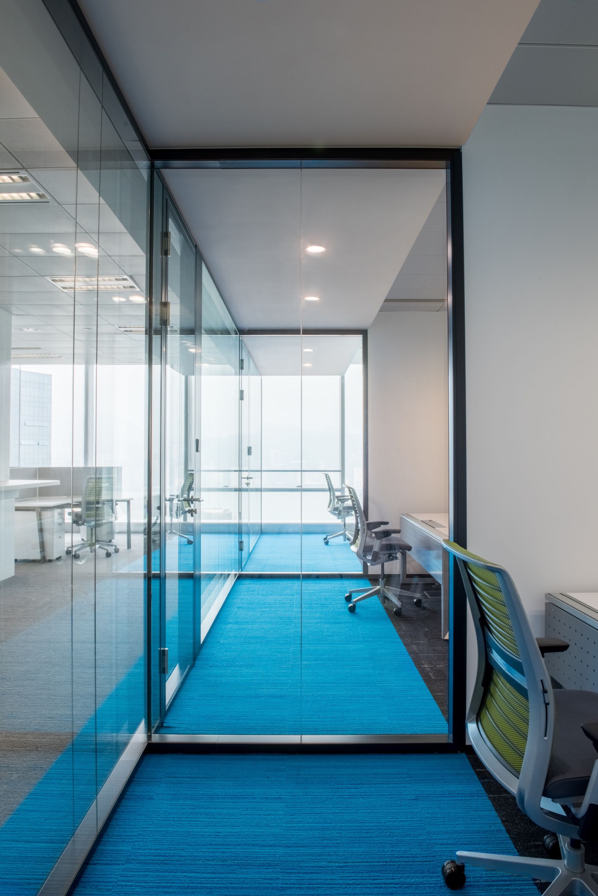
Precise alignment of glazed partitions, ceiling features, carpet accents, and window mullions combine to create simply beautiful features for the space. T-sections of glazing were installed to allow more natural light to penetrate into the innermost private room and to open the visual angle for senior staff while seated at their desks. The end result is a picture-perfect office.
Cantilevered Reception Desk
We desgined a unique cantilevered "Wood Block" counter for the reception desk, with the appearance of a heavy wooden structure floating in a marble facade. The Wood Block conceals all the IT equipment, cable and power management, and personal belongings for IB's receptionist.
Casual Seating
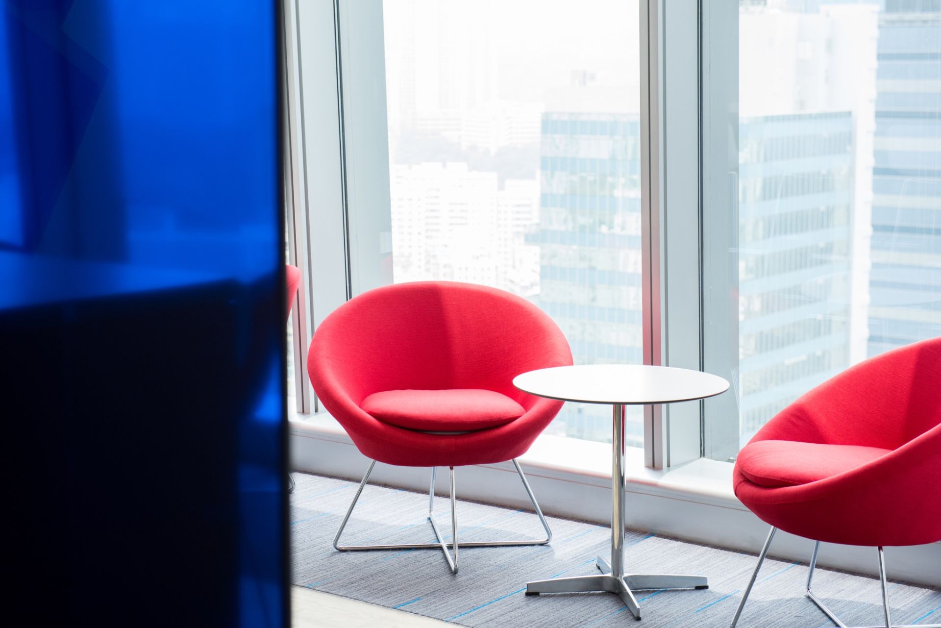
Casual seating has been spread throughout the office, offering ample opportunities for casual conversation between team members and with visitors.
