Whole Building Public Space Refurbishment and Rebranding
Gaw Capital & Silkroad Property
The Grid, 133 Wai Yip Street
After seeing our work for SPACES in the same building, the landlords of 133 Wai Yip Street, Gaw Capital and Silkroad Property, offered us the opportunity to participate in their rebranding and public spaces upgrade. Our "low-impact" improvement solution involved various claddings for exposed concrete surfaces, light weight finishes on the floors, and adjustment of the light color temperature and intensity for a more welcoming environment.
Exterior Signage
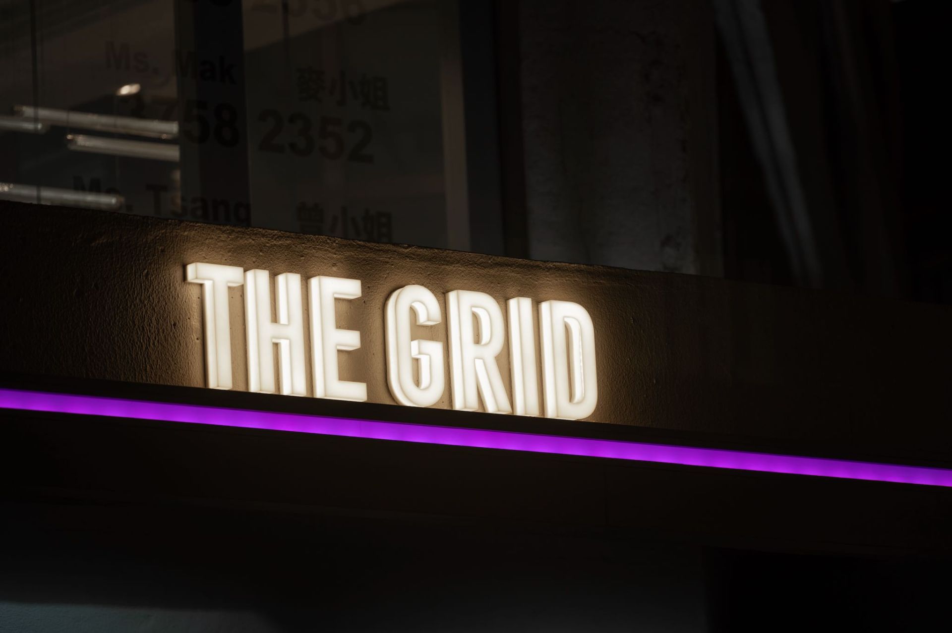
Illumated exterior signage and a wrap-around lighting feature on the ground floor canopy is the perfect highlight for this high traffic location at the intersection of Wai Yip and Lai Yip Streets in the Ngau Tau Kok neighborhood of Kwun Tong.
Main Lobby Enhancement
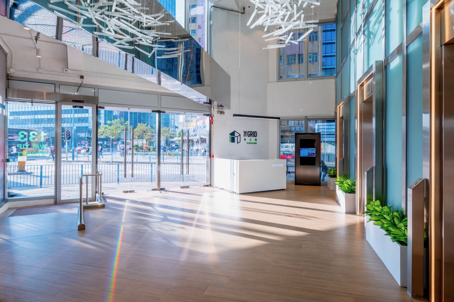
For the main lobby enhancement work, we could only work over a holiday break in order to avoid disruption to the existing tenants -- therefore we chose a wood-pattern ceramic tile to lay on top of the existing epoxy painted floor, which could be installed with minimal modification to the existing floor screed. Lighting improvements, illuminated lift gantries, and loose planters gave the space a more lively feeling.
Highlighting the Lighting
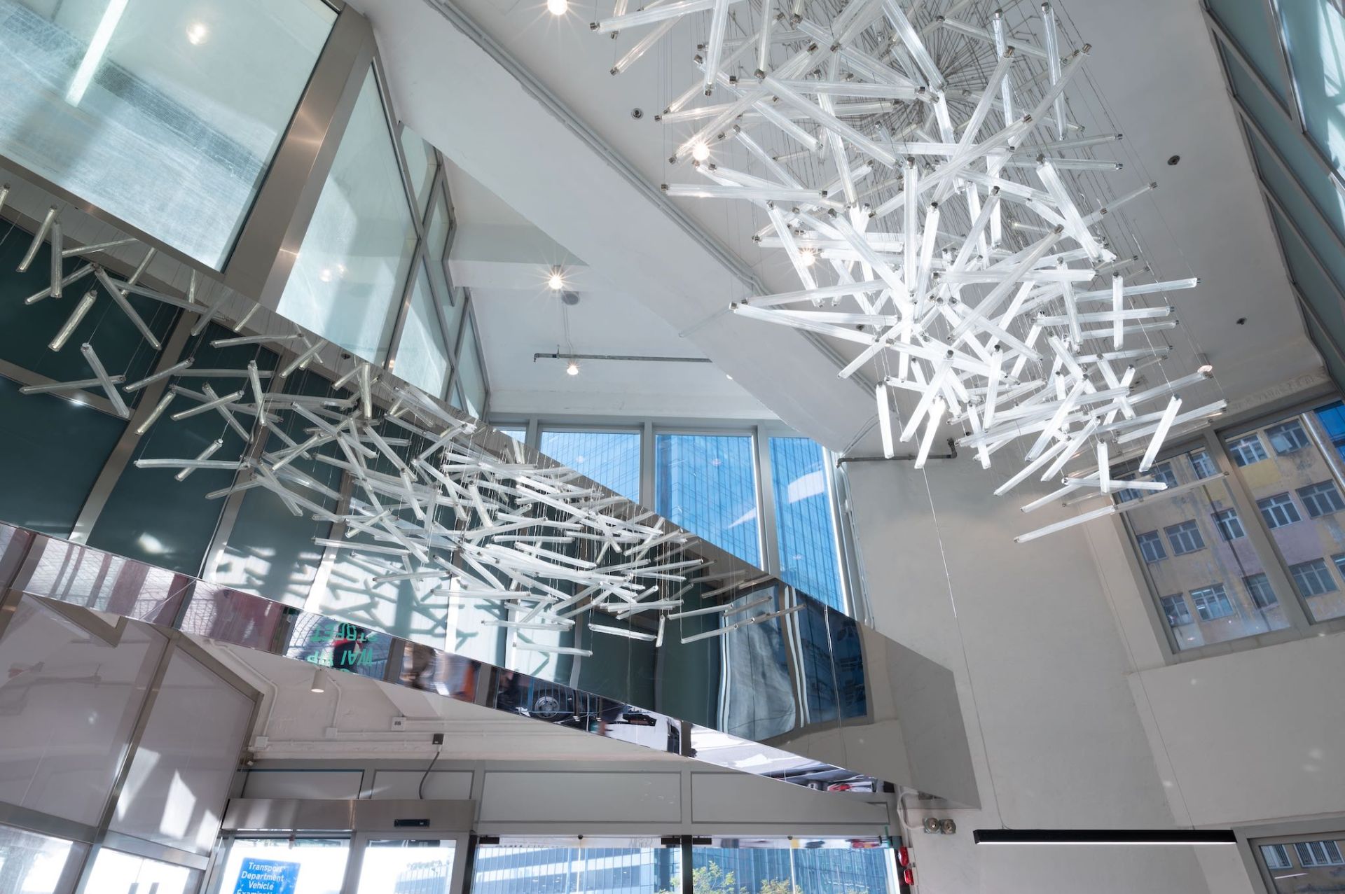
The building's owner had long struggled with how to better showcase the custom made LASVIT feature light installation in the main lobby, as it was mostly blocked from view by a large exposed structural beam. Our "lightbulb" solution was to add a mirror finish stainless steel cladding around the beam, doubling the effect and exposing angles which were previously impossible to view.
Lift Lobbies & Corridors Enhancement
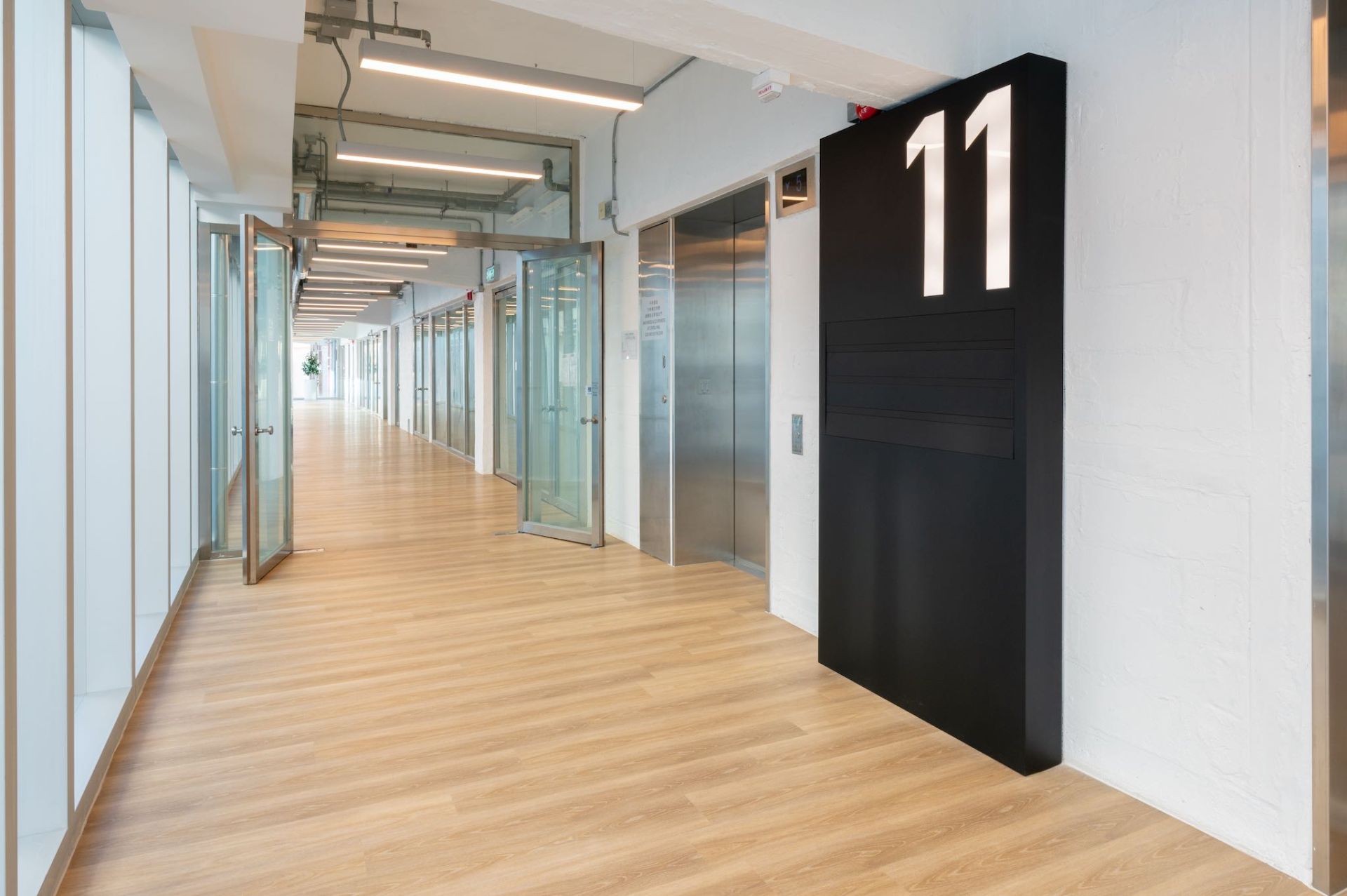
The largest scope of work in this project involved improvement of the common corridors and shared lift lobbies throughout the building. We refinished the floors with quick lay rigid SPC planks to mimic the main lobby feeling without needing to modify the subfloor. A new black powdercoated steel floor directory box was added to give the tenants more exposure and act as an anchor for the long glass corridor.
In order to avoid changing the original architectural outlook and effect, we retained the existing linear light fixture shape, but replaced the outdated lighting elements with energy efficient LED luminaries in a warmer color tone.
Car Park & Loading Bay Improvements
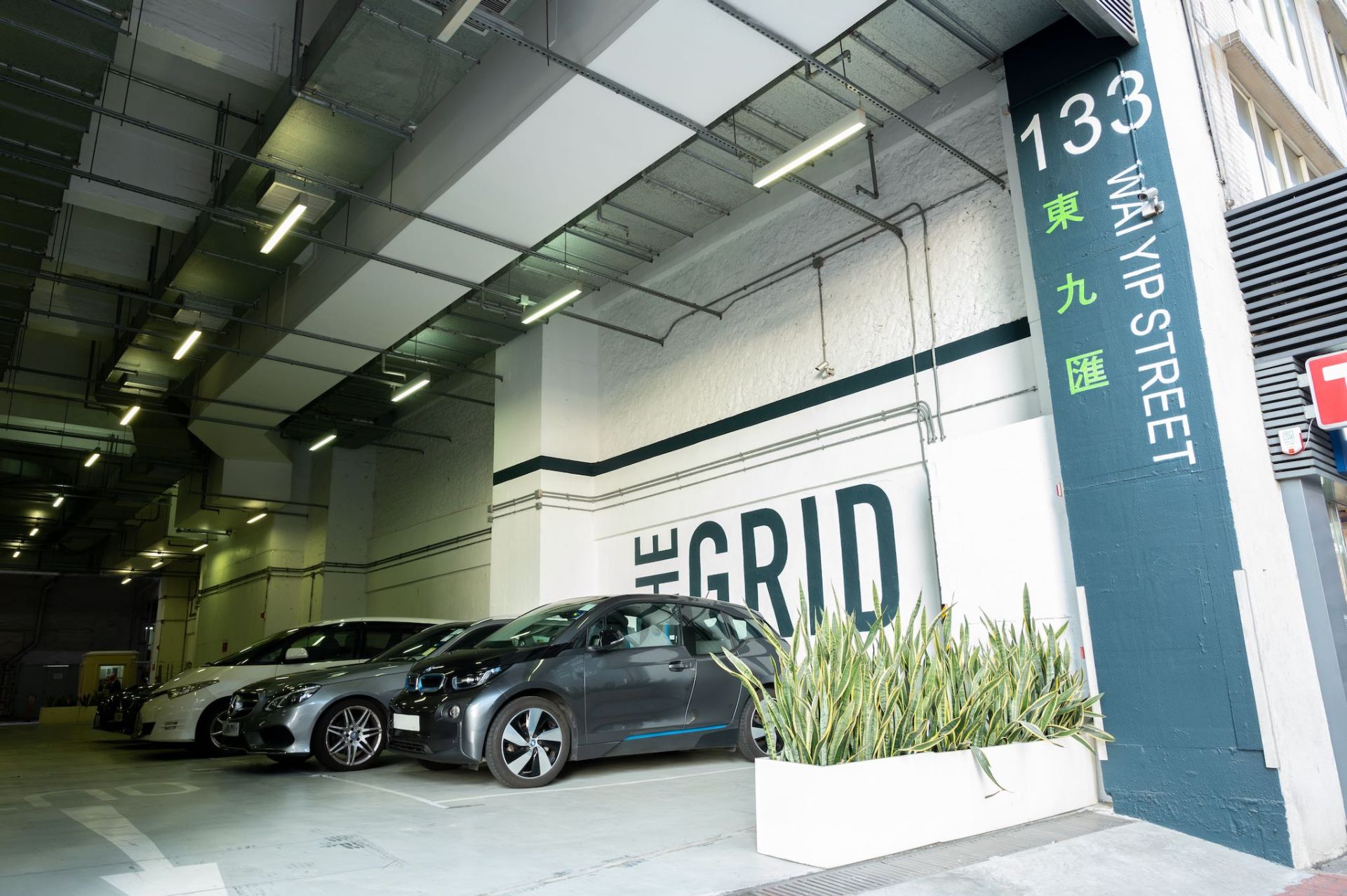
We also added graphic branding elements to the existing private car park wall (which has high exposure street frontage), and designed a new lighting feature on the cantilevered overhang above the back street loading bay.
